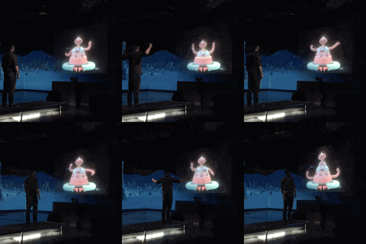
Character Proxemics installation
As part of Pictoplasma’s expansive Inter_faces exhibition at Silent Green Kuppelhalle, Berlin, I was commissioned to create a life-size holographic installation and immersive background that encouraged visitors to interact and engage. The project was called Character Proxemics and I was featured alongside character artists; Julian Glander, Peter Millard, Elenor Kopka and Eran Hilleli, with sound design by David Kamp.
For my part I created a tiered totem-like character, that revealed further layers and behaviours as visitors approached, pulling them into a a percussive dance.
Scroll down for images and footage as well as a breakdown of the process.
Visitors could approach the hologram one at a time on a elevated catwalk. Sensors detected proximity and the frequency of a user’s movement. Using this data, the projected character would grow, retract and engage in different behaviours.
Making of
Character design
When deciding on the theme of my piece as is often the case I looked to animal behaviour. Specifically avian courting rituals and the dance of the peacock-spider. I love the way in which anatomical details and flourishes are nested and hidden until required to entice a mate or dominate a rival. I constructed my character on this principle, a totemic construction that reveals more with increased engagement. This along-side the technical consideration of the space.
I knew the character was going to loom large and I enjoyed the idea of it’s first appearance being quite unassuming, but giving a hint of what was to come - the body has the appearance of a container and there are grooves along the top that suggest it might have a telescopic function. As the character grows and reveals it’s layers, it produces a new layer of instrumentation contributing to the sound-track playing in the hall.
The character sleeps at the beginning on the experience. The body is container-like with grooves in it’s yellow surface to hint at the functions that are to come.
The character fully extended, then the user is at their closest. Each layer represents it’s own patterns of behaviour and produces it’s own sound, created by David Kamp.
This is an initial sketch of the character. Originally I’d thought about giving it interchangeable heads, which are what you can see to the left and the right. I also charted the characters growth against the height of the average person. This is because I wanted the character to be looked down upon at the beginning of the experience and out-grow the user by the end of it.
Something that really dictated the structure of this design was that I wanted each tier to nest within the previous in such a way that could be physically possible. This meant that the dimensions of each tier were dictated by the relative angles of the base-tier, as that angle would remain consistent to peak of the totem. So a lot of my time was spent attempting to get an interesting mix of forms within the confines to the totem’s structural limitations. I drew a lot of wavy lines.
At this stage I intended the character to have tiny feet, but later opted to have large crossed legs. Partly because this aided the feeling that the character is sleeping at the point of entry, but mainly because I could increase the sense of scale of the character using the horizontal axis, literally make it a sleeping giant.
The next phase was to begin laying out the character in Illustrator. This was to further refine the angles of the character and test with curves and ratios that it would actually function in the way that I intended.
One of the biggest technical issues I faced was that I wanted to have a double-ended set of arms that snake their way up and down the body. I wanted the tier that is currently at the top to have the arms and the tiers below to resemble an extended torso. This meant that the holes the arms reach into would have to be equidistant and at a consistent depth on each tier so that when the arm reaches in it has a pleasing arch, as represented by the three curves on each side of the illustration.
These vectors formed the beginning stages of my 3D model and dictated the dimensions that informed the rest of the process. The design changed over the course of production, but the fundamental elements remained the same.
Interactivity
The interactive framework was predetermined for this project, meaning I had to work within the confines of the system. This was good in that it soon became apparent that there had to be a set of limitations in order to turn this into a cohesive experience and deliver it on my own and in time.
The principle that underpins the interactivity is quite simple. There is a sensor at the base of the character and there are two inputs it can recognise; proximity (how close the user is to the sensor) and volume of movement (how much the user is moving their arms etc). Users walk along a catwalk towards the character and it reacts to the combined data of these two inputs.
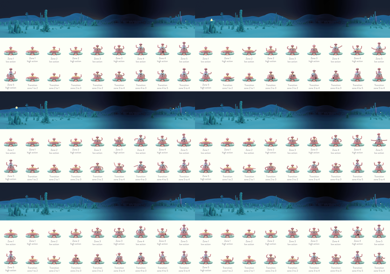
The catwalk is divided into 5 zones. As the user moves through these zones, the character accesses a different set of potential outcomes.
There are 18 clips that combine to give the character it’s full range of behaviours; a looping animation for each zone where the user is static, a looping animation for each zone where the user is moving and a set of transitions back and fourth though each zone.
Here you can see each of the constituent animations that made up the experience.
This diagram depicts the flow from one animation to the next depending on user actions. You can cross reference the labels on the chart to the animations to the left.
Assets for the hologram were also used to create Pictoplasma’s 2019 intro, which you can view below.


